
CHELLE skincare
A personalized skincare shopping experience designed to reduce overwhelm, increase ingredient transparency, and help users confidently build routines
aligned with their skin goals and values.

.png)
Problem
Modern skincare shopping can feel intimidating and inaccessible, especially for users trying to navigate complex ingredients, conflicting advice, and endless product options. Users need a guided, trustworthy experience that simplifies decision-making while supporting transparency, sustainability, and self-confidence.
solution
I designed a modern skincare e-commerce experience focused on personalization, ingredient transparency, and user education. The platform guides users through a tailored skin quiz, curated routines, and simplified product information to reduce overwhelm and support confident purchasing decisions.
research & discovery
Competitive Analysis:
I evaluated leading skincare brands, including Avatara, The Ordinary, and Glow Recipe, to understand how users discover products, learn about ingredients, and navigate online skincare shopping experiences. While each competitor excelled in areas such as product education, visual design, or personalization, the research revealed an opportunity to create a more approachable experience that balances clinical credibility with simplicity. These insights informed Chelle's focus on inclusive messaging and streamlined product discovery.
.png)
Key Findings:
Through competitive analysis and industry research, I identified recurring themes across the skincare shopping experience. While many brands excelled in product quality and visual branding, opportunities existed to better support users in understanding ingredients, discovering products tailored to their concerns, and building effective skincare routines.
These findings revealed an opportunity for Chelle to differentiate itself through a more guided, personalized experience that reduces decision fatigue and helps users shop with confidence.
Users are often overwhelmed by the number of skincare products available.
Ingredient lists can be difficult to understand and compare.
Many skincare sites focus on products rather than routines.
Product recommendations often lack personalization.
Educational content is frequently disconnected from the shopping experience.
defining the experience
Primary User Persona:
Meet Jaysea Nguyen, a representation of Chelle’s core user: someone navigating the overwhelming world of skincare in search of clean ingredients and a routine that actually makes sense for their skin.
Jaysea’s motivations, frustrations, needs, and expectations shaped a design approach centered on clarity and personalization. This transforms a crowded shopping experience into a guided journey toward a skincare routine tailored to her unique concerns.
.png)
POV Statement + How Might We:
Jaysea Nguyen is a skincare-conscious shopper who feels overwhelmed by the number of product choices and unclear ingredient claims when trying to build a routine that actually works for her skin. She needs a simple, trustworthy way to understand what products are right for her so she can confidently create a personalized skincare routine without confusion or trial-and-error frustration.
These How Might We questions guided the design of Chelle, shaping an experience focused on clarity and trust—turning skincare discovery into a simplified, supportive journey that helps users find products that truly work for them.

ideation & planning
User Flow:
To create a seamless purchasing experience, I designed Chelle’s shopping flow to minimize friction from discovery to checkout. Users can move from browsing best sellers on the homepage to product exploration, cart review, and checkout in just a few intuitive steps. The flow prioritizes clarity, visual hierarchy, and ease of purchase while maintaining a calm, elevated shopping experience consistent with Chelle’s brand identity.

Information Architecture & Sitemap:
Chelle's information architecture was designed to guide users effortlessly from product exploration to purchase. This sitemap organized Chelle into four core pathways—product exploration, quick navigation, bag and checkout, and support resources—allowing users to easily browse products, manage their accounts, and complete purchases with minimal friction.
Establishing this structure early helped ensure that content was organized logically, reduced cognitive load, and provided a scalable foundation for both desktop and responsive experiences.
.png)
Low-Fidelity Wireframing + Feature Planning:
Before moving into high-fidelity designs, I sketched low-fidelity wireframes to explore layout options, content hierarchy, and key user interactions. These early concepts focused on the homepage and best sellers experience, helping define how users would discover products, navigate the site, and move toward purchase. I also explored responsive tablet layouts to ensure the experience remained intuitive across devices. Alongside wireframing, I began planning Chelle's visual identity by establishing product branding, packaging concepts, and design elements that would support a cohesive and recognizable brand experience.


visual design
Design System:
To create a cohesive and polished visual experience, I developed a design system that defined Chelle’s core interface elements, including typography, color choices, chips, icons, logos, buttons, dropdowns, and selection controls. These components helped establish consistency across the website while supporting a clean, approachable, and trustworthy skincare brand identity.
The design system also created a scalable foundation for the shopping experience, ensuring that key interactions—such as filtering products, selecting payment options, navigating dropdowns, and using call-to-action buttons—felt clear and visually connected throughout the user journey.
Accessibility Considerations:
To ensure Chelle was designed with accessibility in mind, I referenced WebAIM’s accessibility guidelines for designers throughout the visual design process. I paid close attention to color contrast, heading structure, scalable typography, readable spacing, and clear interactive states to support a more inclusive shopping experience.
These considerations helped guide decisions across the interface, from product cards and navigation to buttons, forms, dropdowns, and checkout selections. By prioritizing accessibility early in the design process, Chelle became easier to navigate, read, and use for a wider range of users.

Branding + Product Design:
Chelle’s branding and product design were created to feel clean, minimal, and approachable while maintaining consistency across the full skincare line. Each product mockup was designed with a cohesive visual system, using soft colors, clear labeling, and simple packaging layouts to reflect the brand’s focus on clean ingredients and easy-to-understand skincare.
Across all eight products, I focused on creating a polished and unified collection that felt realistic, trustworthy, and visually connected to the website experience. The final product lineup showcases how Chelle’s brand identity extends beyond the interface, supporting a consistent shopping experience from product discovery to checkout.


High-Fidelity Wireframes:
The high-fidelity wireframes brought Chelle’s visual direction and content strategy together into a polished website experience. The homepage was designed to introduce users to the brand, highlight best-selling products, communicate Chelle’s mission, and guide users toward personalized product discovery through the skincare quiz. To build trust and strengthen the brand story, the homepage also included sections focused on inclusive skincare, science-backed formulations, customer reviews, and clear footer navigation.
The About page expanded on Chelle’s core values—clean ingredients, sustainable packaging, cruelty-free practices, and science-backed skincare—while reinforcing the brand’s philosophy through thoughtful formulation, simplicity, transparency, and a skin barrier-first approach. Together, these screens helped establish Chelle as a skincare brand that feels clean, credible, approachable, and easy to navigate.
.png)

Walkthrough: Skin Quiz
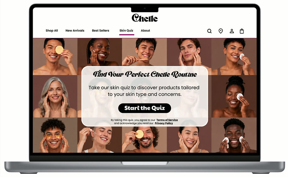
The skin quiz walkthrough demonstrates how Chelle guides users toward a personalized skincare routine through a simple, question-based flow. The quiz includes nine questions focused on the user’s skin type, concerns, goals, and routine preferences, allowing users to select answers that shape their final product recommendations.
After completing the quiz, users are taken to a results page that introduces “Your Chelle Routine,” where they can explore products tailored to their needs. In this walkthrough, the user selected a simplified routine with three steps or fewer and was paired with the Gentle Gel Cleanser, Hyaluronic Acid Serum, and Nourishing Moisturizer.
This flow was designed to reduce decision fatigue, make skincare feel more approachable, and help users confidently discover products that align with their specific skin concerns and desired routine.
Walkthrough: Item Checkout
The checkout walkthrough demonstrates how users move through Chelle’s shopping experience from product discovery to order confirmation. Starting on the homepage, the user navigates to Best Sellers, selects the Hyaluronic Acid Serum, reviews product details and customer feedback, and adds the item to their cart.
From there, the user continues to checkout and logs into their account, allowing saved delivery and payment information to appear for a faster, more convenient checkout experience. After selecting “Pay Now,” the user is taken to an order confirmation page that includes their order summary, payment details, shipping information, and a notice that tracking information will be sent shortly.
This flow was designed to create a clear and trustworthy checkout experience, reducing friction while helping users feel confident and informed throughout the purchasing process.

testing & iteration
Iteration and Refinement:
Chelle went through three rounds of in-person usability testing with 2–4 participants per round, allowing the design to evolve from low-fidelity wireframes into a more polished, high-fidelity experience. Throughout testing, feedback focused primarily on the skincare product designs, visual direction, imagery, and overall readability of the interface.
Participants responded positively to Chelle’s bold colors, minimal layout, and fun, whimsical brand personality. They also emphasized the importance of keeping product labels easy to read and making it clear what each skincare product was designed to support. Because the overall feedback was well received, the final refinements were focused on small but meaningful improvements to visual clarity, product consistency, and presentation.
These iterations helped strengthen Chelle’s final design by creating a cleaner, more cohesive experience that felt approachable and easy to understand.
The “Your Bag” page evolved from a simple low-fidelity layout into a polished high-fidelity screen with clearer hierarchy, refined spacing, and more intentional checkout details. These adjustments helped make the bag experience feel cleaner, easier to scan, and more aligned with Chelle’s overall visual design.

.png)
The skin quiz below evolved from a basic, low-fidelity flow into a more refined, high-fidelity experience with a stronger visual hierarchy and more intentional button styling. These updates helped make the quiz feel more interactive, polished, and easier for users to move through confidently.


conclusion
Chelle was a passion project that allowed me to combine my love for skincare with my interest in creating engaging and user-centered digital experiences. Throughout the project, I explored how thoughtful branding, clear information architecture, personalized product discovery, and bold visual design could work together to create a skincare website that feels approachable and fun to use.
This project allowed me to design beyond the interface by developing product mockups, refining the brand identity, and conducting usability testing to strengthen the overall experience. Through each round of feedback and iteration, Chelle evolved into a more polished and cohesive design that supports users in finding skincare products with clarity and confidence.

Moving Forward:
Moving forward, I would continue expanding Chelle by conducting additional usability testing with a larger and more diverse group of users to further validate the shopping experience, skin quiz, and checkout flow. I would also explore opportunities to refine the quiz logic, expand product education, and strengthen personalized recommendations based on different skin types, concerns, and routine preferences.
Future iterations could also include a fully responsive mobile experience, additional product pages, accessibility testing, and more detailed post-purchase features such as routine guidance, order tracking, and skincare tips. These next steps would help Chelle grow into a more complete and supportive skincare shopping experience.